Color Psychology in Print Marketing: How to Choose Colors that Connect with Your Target Audience
Colour psychology is the study of how colours affect human behaviour, emotions, and perceptions. In the world of print marketing, understanding colour psychology can play a crucial role in influencing the decisions of your target audience. Selecting the right colours for your marketing materials can help you effectively communicate your brand’s message and connect with your customers.
This article will guide you through the process of choosing the right colors for your print marketing materials and provide tips for effective color combinations.
How to Select Colors
Before you begin designing your marketing materials, it’s essential to understand the meanings and emotions associated with different colours. In Malaysia, various cultures and beliefs may affect colour preferences, making it crucial to consider your target audience.
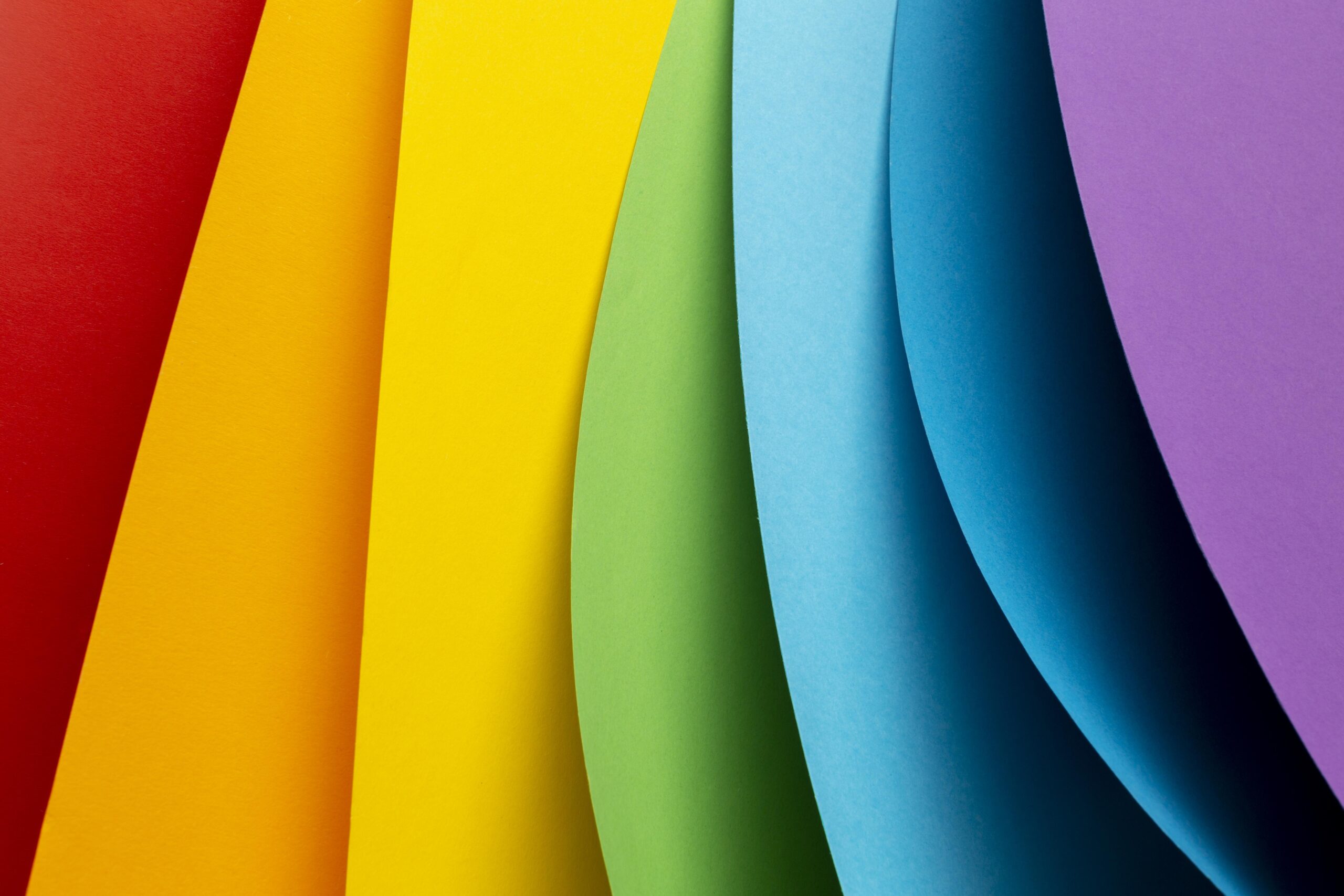
Here are some common colours and their meanings:
- Red: Passion, energy, and excitement
- Blue: Trust, stability, and calmness
- Yellow: Optimism, happiness, and warmth
- Green: Growth, nature, and harmony
- Orange: Creativity, enthusiasm, and success
- Purple: Luxury, spirituality, and mystery
- Black: Power, sophistication, and elegance
- White: Purity, cleanliness, and simplicity
Colours can evoke certain emotions and perceptions, which can have a direct impact on your audience’s response to your marketing materials. For instance, red can create a sense of urgency, making it suitable for sales promotions, while blue can establish trust and reliability, making it an excellent choice for businesses in the financial or medical sectors.
Applying Color Psychology in Print Marketing
When it comes to applying color psychology in your print marketing materials, such as brochures, flyers, and business cards, consider the following tips:
Identify your target audience: Determine the demographics, cultural background, and preferences of your target audience in order to select the most appropriate colors.
Reflect your brand’s identity: Choose colors that represent your brand’s personality, values, and goals. This will help create a strong brand image and establish a connection with your audience.
Use colors to guide attention: Utilize contrasting colors or accents to direct your audience’s focus to essential elements of your marketing materials, such as your call-to-action or your company logo.
Examples of Successful Color Psychology in Print Marketing
Apple: Apple, known for its sleek and minimalist design aesthetic, often utilizes white and silver colors in their print marketing materials. These colors convey a sense of simplicity, elegance, and sophistication, reflecting the company’s commitment to producing high-quality and innovative products. Apple’s choice of colours has helped establish a strong brand identity that sets them apart in the technology market.
Maybank: Maybank, one of the largest banks in Malaysia, has strategically used the color yellow in its print marketing materials. The color yellow, which is associated with optimism, happiness, and warmth, can evoke feelings of trust and financial security among customers.
By using this color consistently across its promotional materials, Maybank has established a strong brand identity and maintained its position as a leading financial institution in Malaysia.
Malaysian Airlines: As the national carrier of Malaysia, Malaysian Airlines has successfully utilized the color blue in its print marketing materials to create a sense of trust, stability, and calmness. Blue is often associated with the sky and the travel industry, and it communicates a sense of reliability and safety.
By incorporating this color into their marketing materials, Malaysian Airlines has been able to create a strong brand image that resonates with travelers worldwide.
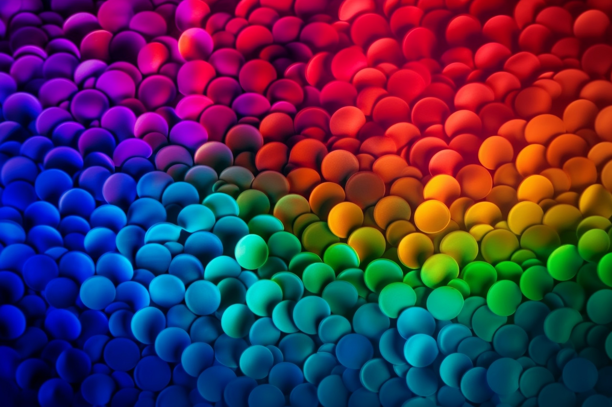
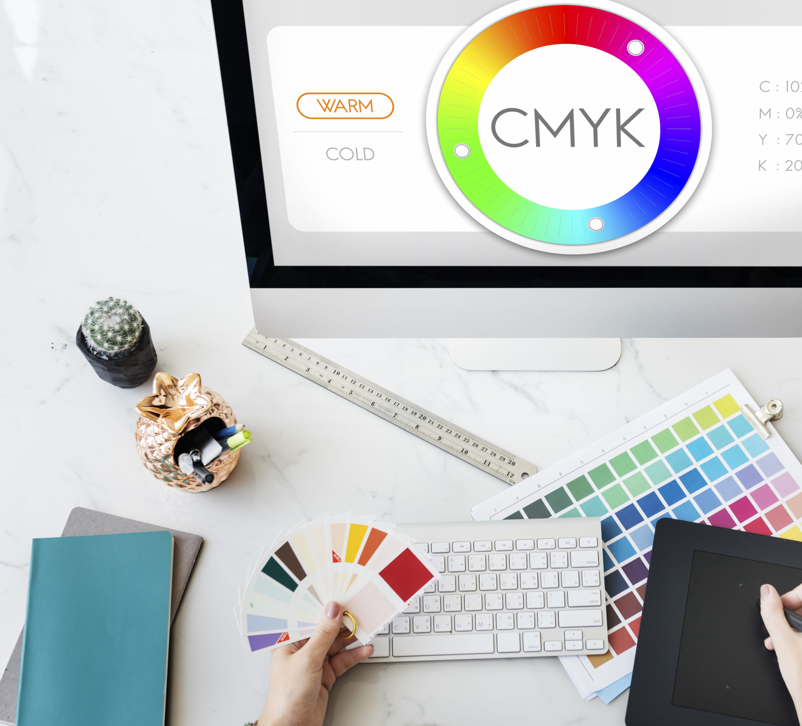
Tips for Effective Color Combinations
Use complementary colors: Complementary colors are those that sit opposite each other on the color wheel, such as red and green or blue and orange. These color combinations can create a visually striking and harmonious design.
Opt for analogous colors: Analogous colors are those that sit next to each other on the color wheel, such as blue and green or red and orange. This combination can create a more subtle and cohesive design.
Consider color schemes with three colors: A triadic color scheme uses three colors that are evenly spaced around the color wheel, such as red, yellow, and blue. This combination can create a balanced and vibrant design.
Adjust color saturation and value: Experiment with different shades, tints, and tones of your chosen colors to create depth and variety in your design.
Test your color combinations: Preview your design in various formats and sizes to ensure it looks appealing and legible in all circumstances.
The Impact of Color on Print Material Formats
Different print materials serve various purposes, and the choice of colors may need to be adapted accordingly. Here are some considerations for selecting colors based on the type of print material:
Business cards: Choose colors that reflect your brand identity and ensure the text is easy to read. Consider using a neutral background with contrasting text or accents to make your information stand out.
Brochures and flyers: Use colors that evoke the desired emotions and guide the reader’s attention to essential information. Consider using a combination of complementary and analogous colors to create an engaging and harmonious design.
Posters and banners: Select bold and contrasting colors to capture the viewer’s attention from a distance. Ensure that the text is easily readable, and the colors represent your brand’s personality and message effectively.
By incorporating these additional aspects of color psychology into your print marketing strategy, you can create materials that better resonate with your target audience and drive the success of your marketing campaigns.
Incorporating Color Psychology with Neptune's Services
To harness the power of color psychology in your print marketing materials, consider partnering with Neptune Press. Our team of experienced designers and printing experts can help you create visually stunning and effective marketing materials that resonate with your target audience.
Neptune’s services include the printing and designing of quality marketing materials such as brochures, flyers, business cards, posters, and banners. We work closely with our clients to understand their brand’s identity, goals, and target audience, ensuring that the colours and design elements selected for each project are optimized for maximum impact.
Don’t miss out on the opportunity to create a lasting impression with your print marketing materials. Contact Neptune today to discuss your design and printing needs and let us help you unlock the full potential of color psychology in your marketing strategy.